Small pages big text
Working with the post-it format the team1 (supi, mitsa, erica, me) approached the visual identity with two things in mind:
- The office aesthetic, that kind of default aura that surrounds workspaces
- The blurred line between personal writings such as memos and todolists and formal documents.
We used the post-it format as a module. Short sentences, big font size, different writing styles, few images. The idea was to facilitate a non-linear combination across the original page order of the pubblication. We choose not to put page numbers: instead we opted for a progress bar in each contribution.
In the body of the post-it we stayed simple using a default sans-serif font. We used the Bitsi font from Supi and Jian for the covers of each contribution and the main index.
Post-it
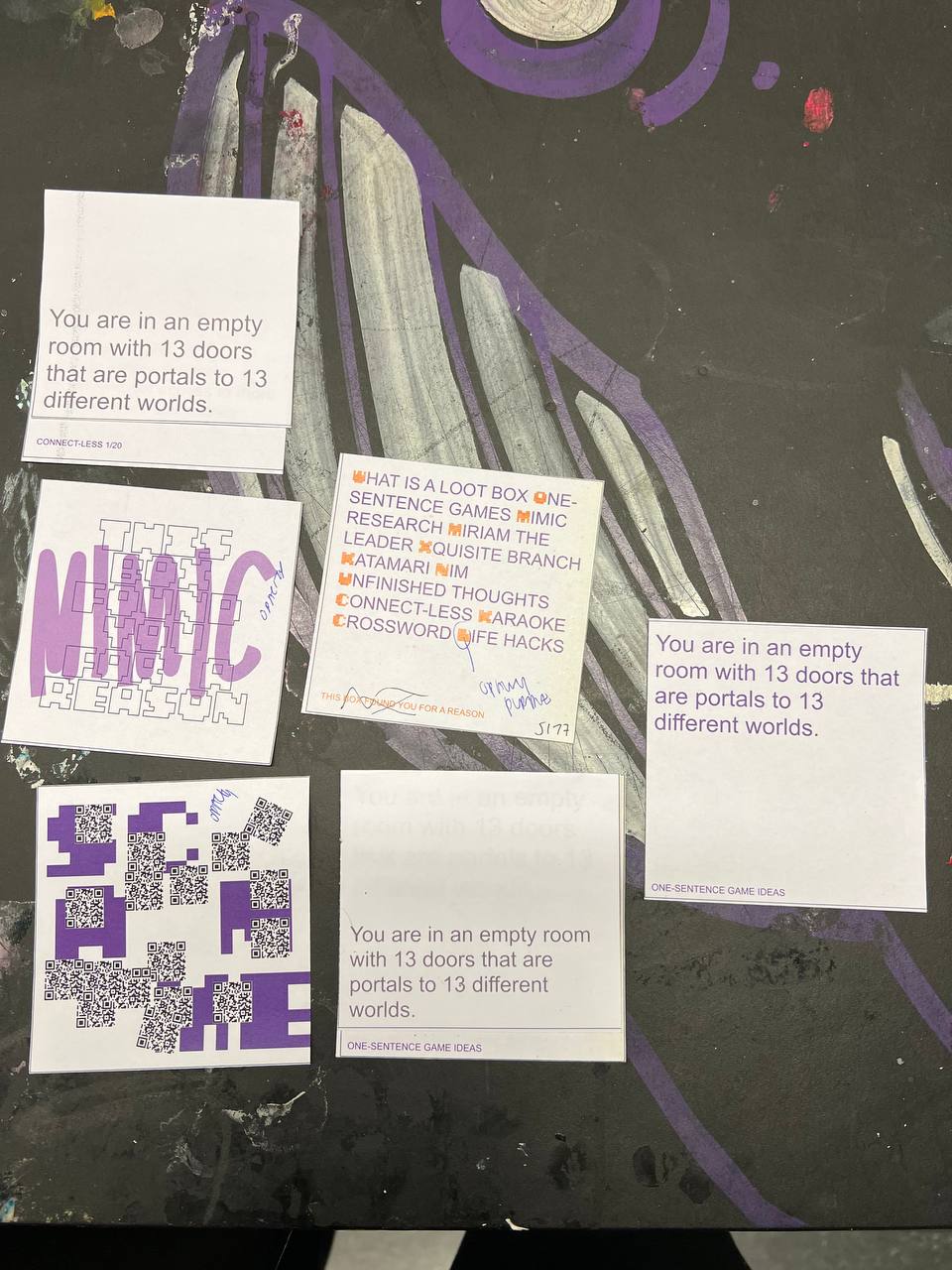
We designed 8 types of post-it: from text and image post-it to complex card layout, we tried to embed the form of every contribution in the generator pipeline.
Text
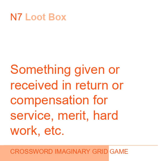
The basic type of post-it was the text one. We went with a super big font-size and an unexpected alignment. After a certain amount of characters the font-size is set to shrink a bit for a small text version.
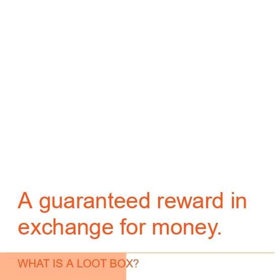 From What is a loot box?
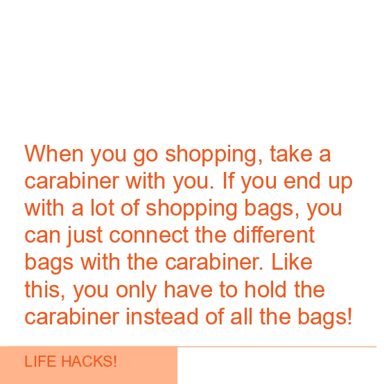 From Life Hacks!
Dialogue
It can display text in the four corners of the postit. Used for the NIM dialogue and some single word sentence in What is a loot box?
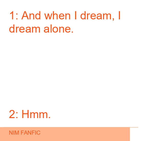 Dialogue
Definition and Cell
Definitions and cells are the main modules for the Crossword Imaginary Grid Game from Emma. Each cell occupies a position in a grid, and is used to build the crossword structure. The definitions indicate a starting point and some hints to guess the word.
 Definition
 Cell
Cell
Card
Card designed starting from the layout Miriam prepared for her version of the game Quartet.
 Card
Card
Image & Picture
For images we decided on a full page approach. We have two post-it: image is for normal images, while picture is for graphics that folllow the pubblication main color. Both can display a caption in overlay.
 From Katamari Fanfic
 From Xquisite Branch
QR code
For QR code we choose to be as messy as possible. QR carries a specific visual language. We tried to force it into something else by cloning each code in repetition, with a glitchy result.
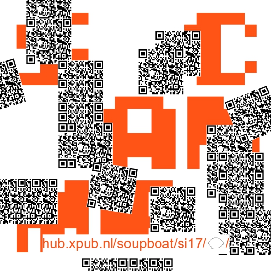 QR codes
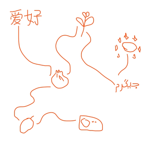
Covers
We played a lot with the contributions' cover. The starting point was always the title of the special issue in the bitsi font. On top of that we designed some sketches related to the contents.
 Katamari Fanfic
 Unfinished Thoughts
 NIM Fanfic
 Imaginary Crossword Grig Game
Index
For the index we used the combination of normal and bitsi font. This approach was reused then in the SI17 home page.
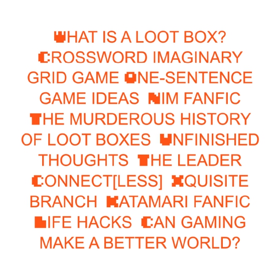 Index
Index